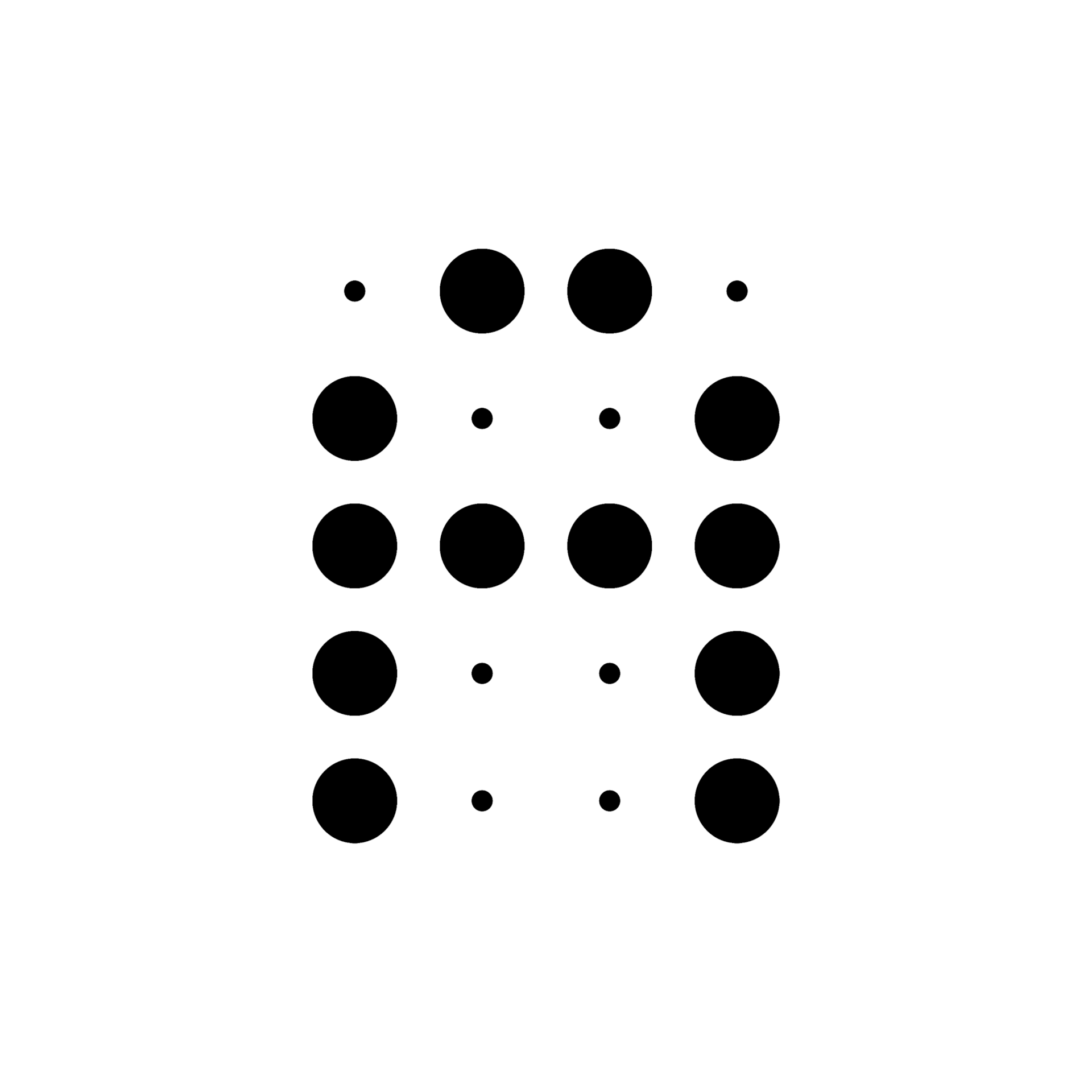
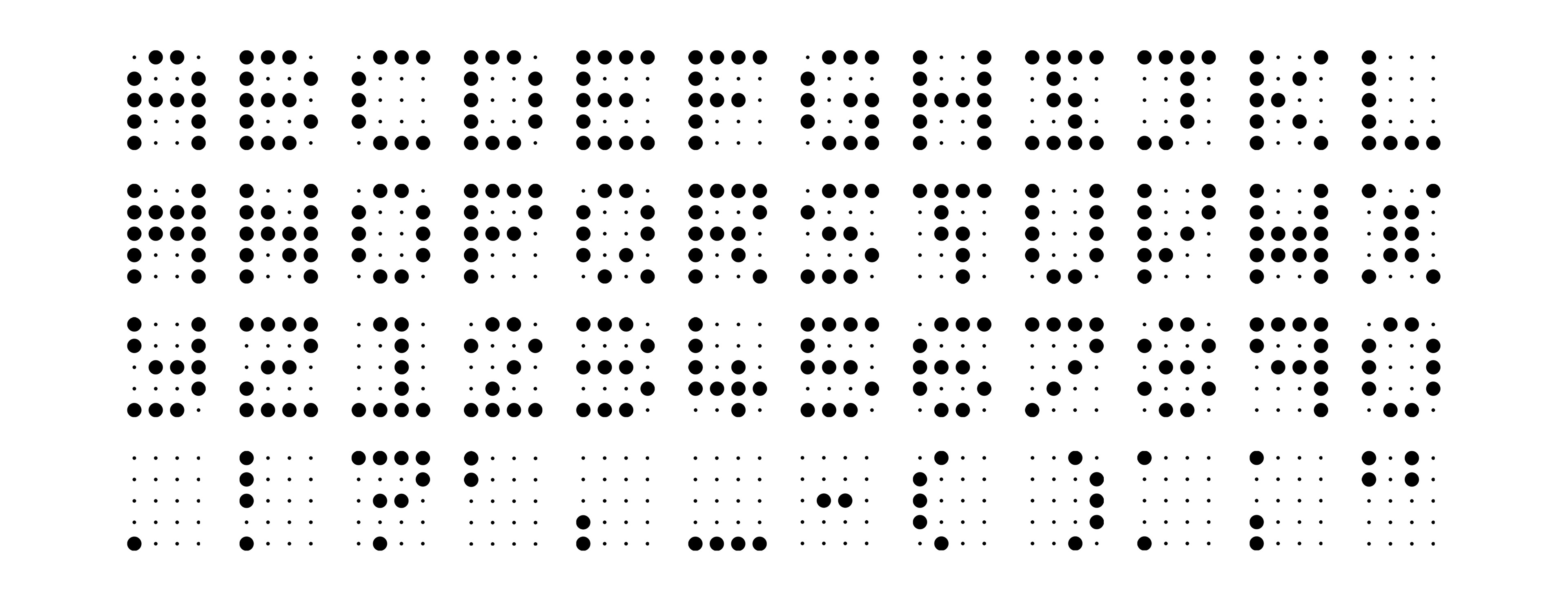
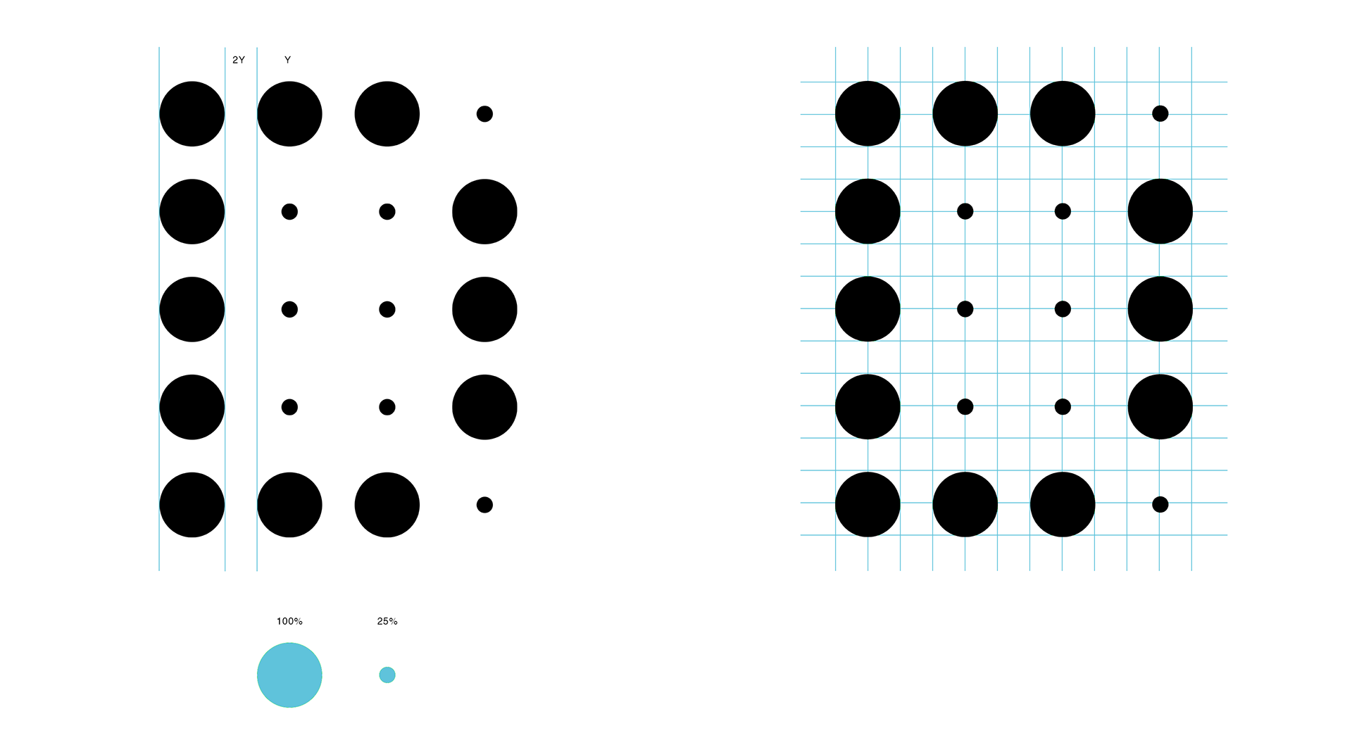
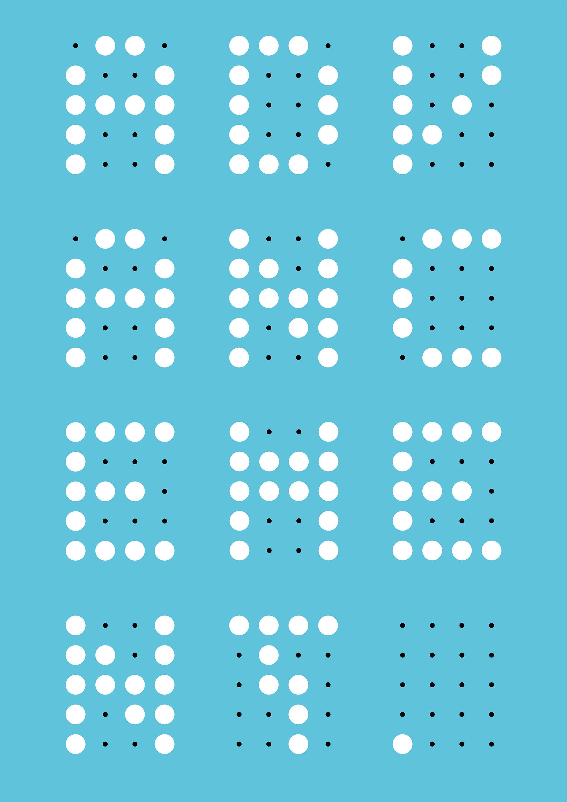
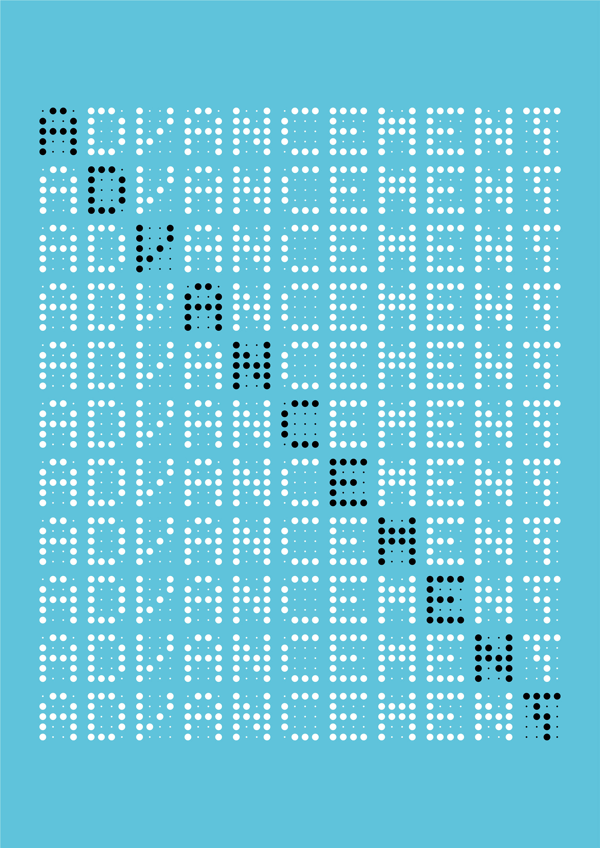
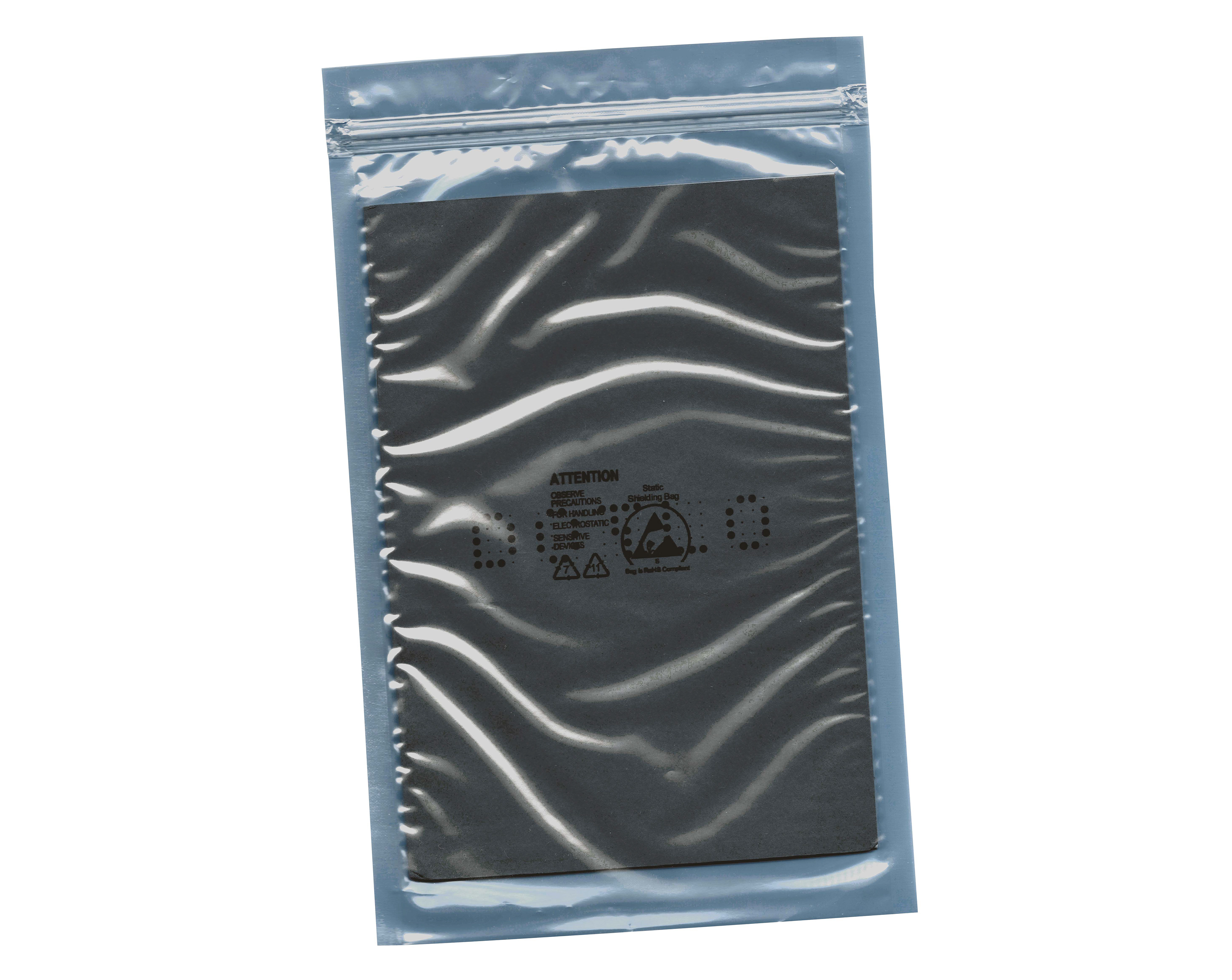
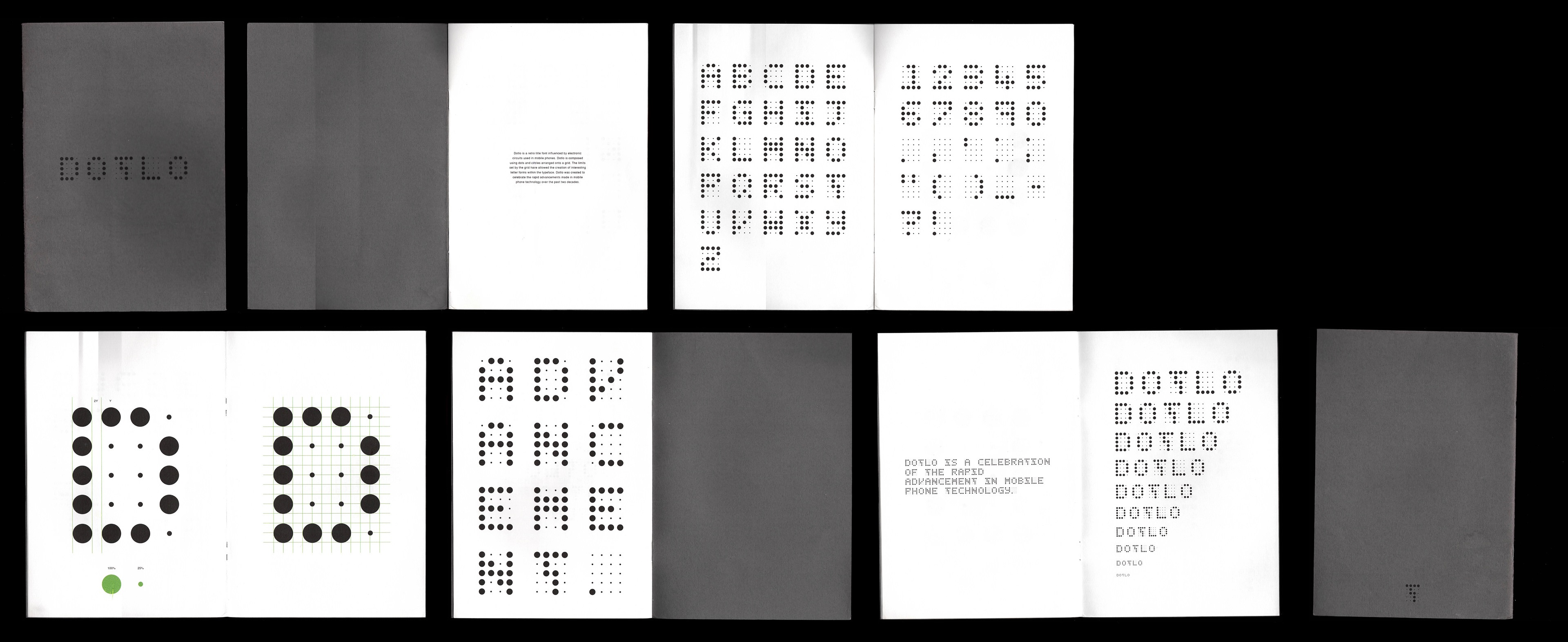
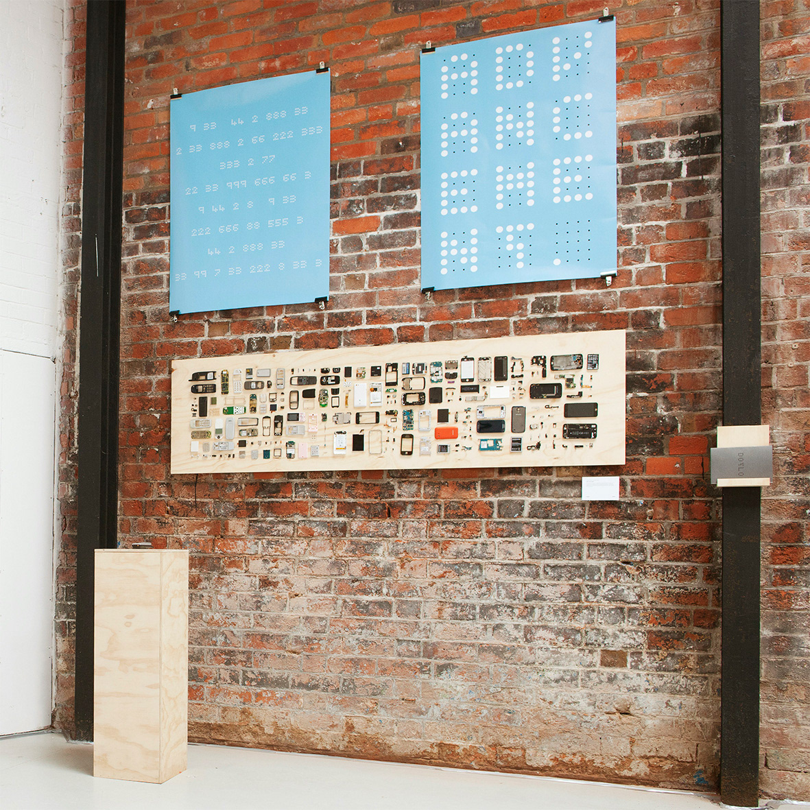
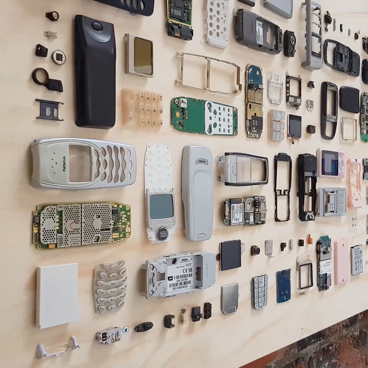
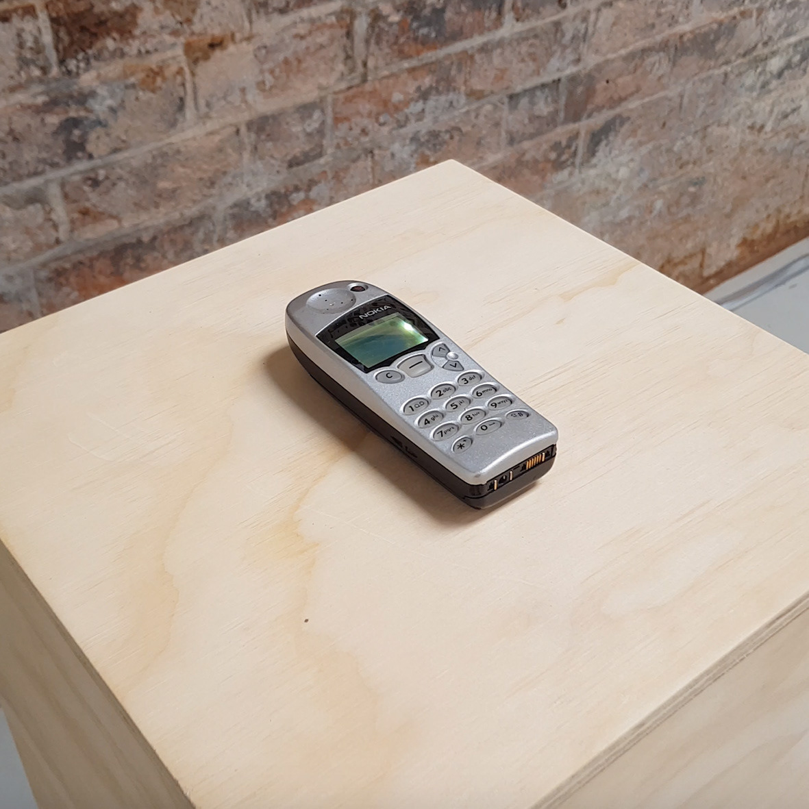
Dotlo, a retro title font, draws inspiration from the intricate patterns of electronic circuits found in mobile phones. Crafted to commemorate the rapid evolution of mobile phone technology over the past two decades. Dotlo is composed using dots and circles arranged on a grid, the deliberate constraints imposed by the grid allowed for the creation of captivating letterforms within the font. This typographic endeavour marked the end of my first year in the HND course, becoming a noteworthy inclusion in the "Thrive" student exhibition at Melting Pot Birmingham. As an additional dimension to the showcase, I crafted a sculpture from disassembled mobile phones. This artistic creation provided viewers with a visual insight into the inspiration behind the font, creating a harmonious synergy between technology, design, and artistic expression.